





When people think about revolutionary colour in art, they usually think of the Fauves.
Henri Matisse.
André Derain.
Wild colours that ignored reality.
Green faces.
Purple trees.
Orange skies.
They changed art forever.
Or did they? They certainly did for me!
The Fauves certainly gave colour its freedom. Yet they were only the beginning. Throughout the twentieth century artists became fascinated by a bigger question.


What actually is colour?
Is it emotion?
Is it science?
Is it psychology?
Is it light?
Or is it simply something our brains invent?
The answers transformed modern art.
The Fauves. Colour becomes emotion.
Until the early twentieth century, colour largely described the world.
Grass was green because grass is green.
The Fauves threw that idea out of the window.
For them, colour became emotional language.
If a red sky expressed excitement better than a blue one, then red it was.
Accuracy no longer mattered.
Feeling did.
That single idea liberated generations of artists, and still is, every day, even right now!

Bauhaus. Colour becomes science.
A few years later, the Bauhaus took almost the opposite approach.
Rather than asking what colour felt like, teachers such as Johannes Itten wanted to understand why colours worked together.
Itten developed his famous seven colour contrasts.
Warm and cool.
Light and dark.
Complementary colours.
Saturation.
Proportion.


These ideas are still taught in art schools throughout the world, the great Formulas of Colour.
What the Fauves had discovered intuitively, the Bauhaus tried to explain systematically with their formulas.
Kandinsky. Colour becomes music.
Wassily Kandinsky believed colours could communicate directly without needing to represent anything at all.
He associated blue with spirituality.
Yellow with energy.
Red with confidence.

He often compared painting to music.
A melody doesn't need to describe a landscape to move us.
Neither, he believed, does colour.
Perhaps more than anyone else, Kandinsky encouraged artists to think of colour as a language in its own right.
This was one of the most influential ‘colour thoughts’ in the whole of the twentieth century.
Paul Klee. Colour becomes rhythm.
Paul Klee took a gentler path, one that influenced me deeply in my twenties.
His paintings often feel less like dramatic statements and more like quiet conversations.
Colours drift into one another.
Nothing is abrupt.
Everything seems to breathe.
He explored rhythm, movement and harmony, believing colour could unfold almost like a piece of music.
His notebooks alone remain among the most influential teaching texts ever written about colour.

Josef Albers. Colour becomes perception.
Perhaps the biggest breakthrough came from Josef Albers.
His book Interaction of Color demonstrated something most people find surprising.
Colour doesn't exist in isolation.

The very same grey square can appear warm, cool, blue or brown depending entirely on the colours surrounding it.
Nothing has changed except the context.
Albers showed that colour is never absolute.
It is always a relationship.
Isn’t this a wonderful insight, that red next to blue looks different to red next to green. People have always intuitively known this about colour relationships, but Albers made the knowledge plain.

Once you've seen his demonstrations, it's impossible to look at colour in quite the same way again.
Colour Field painting. Colour becomes experience.
Artists such as Mark Rothko pushed colour even further.
Instead of painting recognisable subjects, they painted enormous fields of luminous colour.
People often ask what Rothko's paintings are about.
Perhaps that's the wrong question.
They're about standing in front of colour itself.
Rather than depicting emotion, the colour creates it.
Personally, I feel Rothko’s colours represent a kind of ‘low quality of life’, especially when compared to Ellesworth Kelly’s much more cheerful, outgoing colours (see next para). Just an opinion. You’ll have yours too.

Hard Edge painting. Colour becomes precision.
While Rothko softened colour, Hard Edge painters sharpened it.
Artists including Ellsworth Kelly and Kenneth Noland removed almost every trace of the artist's hand.

No expressive brushstrokes.
No textured paint.
Just precise geometry.
Flat, perfectly controlled colour.
The result was remarkably powerful. The cleaner the edge became, the more colour itself took centre stage.

Colour psychology. Colour influences behaviour.
Towards the end of the century, scientists joined the discussion. Yes, you can’t keep the boffins & analysts out.
Their research suggested colour affects attention, mood and decision making.
Red often heightens alertness.
Blue is frequently associated with trust.

Green tends to evoke nature and calm.
Orange is the ‘Buy Me’ colour found in online checkouts, where immediate action (buying) is demanded by the colour itself.
Not every popular claim stands up to scientific or artistic scrutiny, yet there's little doubt that colour changes how we experience spaces, products and works of art.
Today architects, designers and marketers all use these principles, though I suspect a ‘true colourist’ probably doesn’t need these colour maps, in the way, say, an architect might design to a psychological palette because they aren’t natural colourists.
So where does Linda's work fit?
That's actually quite an interesting question.
Linda's work isn't an extension of Fauvism.
Neither is it a continuation of Hard Edge painting.
Her palettes come from her. Just ‘her’ inside.
Like the Fauves, her colour isn't there to imitate nature. It exists for its own expressive power.
Like Kandinsky, her colour communicates without being obliged to represent a recognisable subject like, say, a commission subject of a place or thing. Her inner meaning or truth comes through a balance of shape, harmony and emotional response.
Like the Bauhaus, each composition depends upon carefully balanced relationships between colours. The geometry isn't decorative. It's the structure that allows the colours to work together.
And like Josef Albers, context and colour relationships change everything.

Only here there's an important difference.
Albers was working with paint.
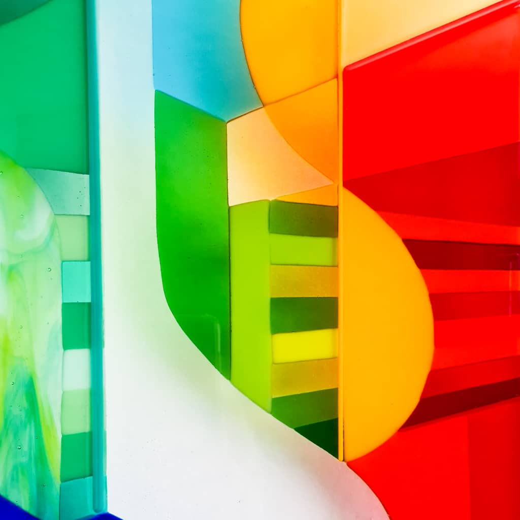
Linda works with kiln fused glass.
Glass doesn't simply reflect light. It transmits it.


No single Hard Edge glass artwork ever looks the same twice. Photographs of her work hardly do them justice because they’re merely freeze-frames of an evolving experience.
That's something painters have rarely been able to achieve.
Artwork that really changes with the light.
Colour is still evolving.
The twentieth century never arrived at a single theory of colour.
Instead it gave us a collection of extraordinary ideas.
Colour as emotion.
Colour as harmony.
Colour as music.
Colour as psychology.
Colour as perception.
Colour as experience.
Every great artist explored one or more of these possibilities.
Some, like Linda, continue the conversation in entirely different materials.
Perhaps that's the real story.
The revolution in colour didn't end with the Fauves.
We're still discovering what colour can do, and the myriad of different ways to apply it.
If you enjoyed this article, you might like this interview with Linda ‘How I decide my art palette’
Leave a comment
Hard Edge glass art blog
View all


ABOUT THE AUTHOR
“Hi, I’m Kevin, Linda’s lifelong soulmate. I’m a professional scriptwriter by trade, for which I’ve won many awards.
My mission is to bring Linda’s genius for colour & form into plain words everybody understands and enjoys.”
